
2013 WWDC app details and Apple icon clue
We are now less than a week away from Apple’s WWDC event that runs between June 10 and June 14 in San Francisco. At the keynote speech on Monday many expect to see the introduction of Apple’s next major mobile operating system, iOS 7. Today we have details for you about the 2013 WWDC app and a snippet about the icon used that may give a small clue about the new look for iOS 7.
Although new hardware is unlikely to be revealed, we are anticipating an iOS 7 unveiling. If you want to know more about the iOS 7 countdown with a roundup of feature news and more see our earlier article here. We’ve also given readers information about live blogging and a keynote video here. However, at this stage it looks highly unlikely that tech enthusiasts will be able to watch live video streaming of the keynote.
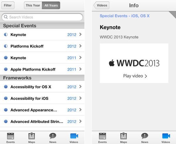
The Apple App Store released the new iOS WWDC app yesterday, and it’s the ideal companion to the event, for developers who are attending and also those who cannot be there in person. Key features of the app include times, locations and session descriptions, the latest news and daily snapshots, and maps of Moscone West to help you find your way around. There is also the ability to receive notifications, provide feedback, and also switch between iOS devices to follow proceedings and pick up where you left off.
A major benefit is the daily availability of session videos on your iPhone or iPad, although these are only accessible to view if you are a Registered Apple Developer. This Apple WWDC app is free and is compatible with iPhone, iPad and iPod touch running iOS 6.1 or later, and it has been optimized for iPhone 5. You can see more or download it from iTunes here.
In our iOS 7 roundup yesterday we showed a leaked image purporting to be of a Home page running the upcoming operating system. This hinted at the new look that has been rumored with a flatter, less skeuomorphic design. Interestingly the Apple WWDC app icon could be a further clue of the newly designed iOS, as it’s a rather more simplistic look than some icons from the past, with no diagonal stripes, borders, or gloss effects. You can see it at the iTunes link above.
We shall, of course, be following 2013 WWDC closely and will be bringing readers plenty of news from the annual event, so please do check back with us from time to time for the latest info. While we wait for the event to begin we’d like to hear from readers about WWDC. Will you be downloading the WWDC app? What are you hoping to hear from the event? Are you looking forward to seeing what Apple’s new look iOS has to offer? Send us your comments to let us know.
Live Comment
Your email address will not be published.