
Android 5.0 UI rendered with minimalistic look
Before Google officially made us aware of the Android 4.4 KitKat update it was widely believed that the next step up from Jelly Bean would be 5.0 Key Lime Pie, but this obviously didn’t happen. Now today the Android 5.0 UI is rendered with a minimalistic look.
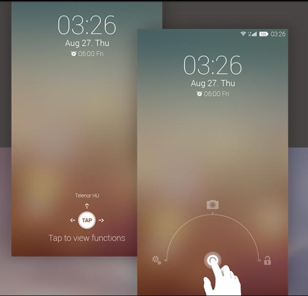
The image you can see on this page is a concept idea from a team of designers from Hungary going under the name of Codebuild. This is one of many renders that the team has come up with for their idea of the next version of the Android operating system.
As you can see it has a clean and simple look with easy to use unlock options that also include extended widgets that also use swipe functions. Swiping down with two fingers will reveal these extended widgets, and the team has redesigned both the app and home screen along with the icons.
Everything is much cleaner with the notification bar given a transparent look and the colour scheme has a nice feel to it, and the renders are even placed onto a Samsung smartphone, and one image shows the weather widget that is less obtrusive.
Of course this is only a concept idea but it would be nice if the engineers at Google took some of the designs on board for the next major release of the Android operating system. Check out the link below for the rest of the images and tell us if you would like to see the next major update to look like this design.
Comments
2 thoughts on “Android 5.0 UI rendered with minimalistic look”
pffft looks like iOS 7, try and be at least A LITTLE original jheez
This design looks a little like iOS 7, though soon you realise the font used is different and obviously, since this is Android, the icons are placed on the top right, instead of being scattered on the left (e.g. Wi-Fi icon and carrier name) and the right (battery, GPS etc.). Plus, iOS 7 does not place the battery percentage inside the battery icon, so I’d give this design a hands up.
Guest rate: 98%